Weather & Clock Widget Plus
- 4.1
- Rating
- 100.00K
- Installs
- $7.99
- Price
 Analysis by App-foxy
I usually judge a weather app by what happens when I am in a hurry: can I read the temperature without squinting, find the forecast without hunting through menus, and understand what the next few hours may bring before I leave home? Weather & Clock Widget Plus makes a strong first impression in that everyday test because it combines current conditions, future forecasts, clock information, and home-screen widgets in one weather-focused tool. I found it most useful when I wanted information at a glance rather than a long explanation.
This is a paid weather app from Interactive Saudi Arabia, listed at $7.99 and rated for Everyone. It has been available since March 7, 2014, and the current release is version 4.5.5.2. Its average rating is 4.1 from around 32 thousand ratings, while its install count has passed 100 thousand. Those figures suggest a reasonably established product, although they do not automatically mean it will suit every phone, eyesight level, or daily routine.
My review focuses less on whether the app can show a forecast—most weather tools can—and more on how comfortably that information can be reached in different situations. For someone who wants a clock and weather panel that stays visible on the home screen, it has a clear purpose. For someone who needs highly specialized accessibility controls, an extremely minimal interface, or a free alternative, the decision is less straightforward.
You May Also Like

 Blood Strike: 2.5 Anniversary
Blood Strike’s Loadouts Turn Every Drop Into a Tactical Gamble
A close look at Blood Strike’s custom loadouts: how fast access to signature weapons reshapes its battle royale rhythm, rewards preparation, and narrows the gap between fights.

 Pandora - Music & Podcasts
Pandora’s Music Is Easy to Start, but Harder to Recover
Pandora’s strength is its low-effort path from a seed to a station. Its weak spot is how much confidence it asks you to place in connection, setup, and quiet recovery.

 8 Ball Pool
 Is Built on Rivalries, Rematches, and Routine
A close look at the rivalries, rematches, shared routines, and unanswered safety questions that turn a quick pool match into a persistent mobile community.

 Samsung Music
’s Quiet Strength Is Playing What You Already Own
Its reach comes less from spectacle than from dependable access to a personal library. That simplicity is both the app’s strongest retention engine and its ceiling.

 AccuWeather: Weather Radar
AccuWeather Review: A Quick, Clear Forecast for Everyday Decisions
For everyday plans, the best forecast is the one you can understand quickly. AccuWeather makes rain timing, radar, and local conditions easy to act on, with a few trade-offs.

 Hill Climb Racing
Why Hill Climb Racing Still Turns Crashes Into One More Run
A tiny car, a bumpy hill and one more upgrade: Hill Climb Racing keeps resurfacing because its simple chaos makes every near-miss feel personal.
More From Our News Desk
View All News


How the layout supports readability and navigation
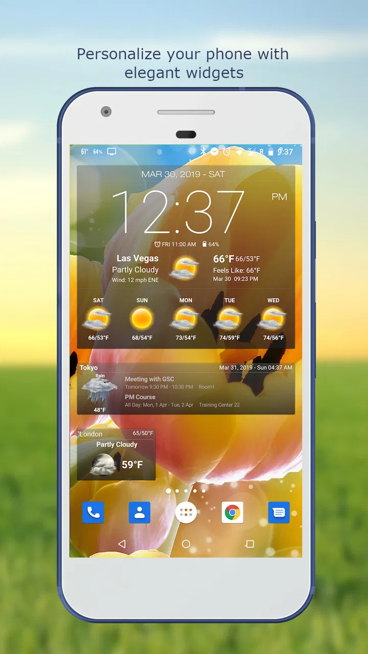
The central idea is simple: put weather and time together so I do not need to open several separate apps. The combination works well for routine checks. I can glance at the widget before getting dressed, open the app when I need a fuller look, and use the clock without treating it as a separate utility. That relationship between the widget and the main weather view is more important than it may sound, because it reduces the number of steps in a common task.
The app’s visual appeal comes from its widget-oriented presentation. A well-placed weather clock can be easier to understand than a crowded notification panel, especially when I only need the current temperature and a quick sense of what is ahead. The useful design question is not whether the screen looks attractive, but whether the most important information remains recognizable when viewed briefly. In my experience, the weather-and-clock pairing gives the home screen a clear information hierarchy: time first, weather close behind, and the forecast available when I choose to go deeper.
That said, widgets are not automatically accessible simply because they are visible. Their usefulness depends on the size selected and the way a particular phone arranges home-screen elements. A compact widget saves space but may force me to interpret small symbols or text. A larger one is easier to scan but occupies more of the screen. I would try more than one available layout rather than accepting the first choice, especially if reading small text is tiring.
Navigation is most comfortable when I approach the app with a specific question. “What is the weather now?” belongs on the widget. “What will the next part of the day look like?” belongs in the forecast view. This division prevents unnecessary wandering. I would not open it expecting a long-form weather briefing or a news-style explanation; its strength is presenting information in a compact, visual way.
For users who rely on consistent visual patterns, the clock can also act as an anchor. Even if I am not interested in the forecast at that moment, the familiar time position helps me orient myself. The trade-off is that weather information often uses icons and short labels, so anyone who finds symbolic interfaces confusing may need to spend more time learning what each visual element means.
The most practical readability tip is to design the home screen around the widget, not squeeze the widget into an already crowded layout. Giving it enough room can make the difference between a quick glance and a frustrating close inspection. I would place it where I naturally look, then remove nearby clutter that competes with it.
Making the first check easier
A realistic morning routine shows where the app earns its place. I can wake up, look at the home screen, check the clock, and decide whether I need a jacket or extra travel time without opening a browser. If the forecast requires more attention, I can continue into the app rather than starting from scratch. This is a small workflow, but it is exactly the kind of repeated action where a widget becomes more valuable than a feature-rich app that requires several taps.
The same approach helps users who prefer predictable routines. Instead of searching for a weather icon among many applications, the information remains in a familiar location. People with reduced attention, temporary fatigue, or difficulty remembering where tools are stored may appreciate that consistency. I would still recommend checking the widget after installation and adjusting its placement, because a useful tool can become effectively hidden if it is placed on a secondary screen.
One limitation is that compact weather information can leave less room for context. A symbol may show a general condition, but it does not replace reading the forecast carefully when plans depend on changing weather. I would use the widget for orientation and the full app for decisions such as commuting, outdoor work, or arranging an event.
Motor, sensory, and situational access in daily use
From a motor perspective, the widget can reduce repeated opening and tapping. That matters for anyone who finds precise touch gestures uncomfortable, tiring, or slow. A glance is less demanding than launching an app, waiting for a screen, and navigating to a forecast. The benefit is not a special accessibility mode; it is a simpler interaction pattern built around the home screen.
There is an important exception. A widget is usually a small target, and interacting with it may require accurate taps. If I only want to read it, that is not a problem. If I need to open a particular part of the forecast, a small control can be less comfortable than a full-screen interface. I would therefore treat the widget as a display first and use the main app when touch precision is difficult.
For low-vision users, the larger layouts are likely to be the better starting point, because more space generally makes text and symbols easier to distinguish. I would also avoid judging the app from a tiny widget placed beside several similar icons. A clean background and a location with good contrast can improve practical readability, although the exact result depends on the phone and the chosen screen arrangement.
Users with color-vision differences should be cautious about interpreting weather through color alone. Weather interfaces commonly pair colors with icons or words, and I would rely on the written condition and forecast details rather than treating a color change as the complete message. If an important decision depends on rain, temperature, or a change later in the day, reading the actual forecast is safer than guessing from the visual styling.
For people who are sensitive to visual clutter, the app’s combination of clock, current conditions, and future information can feel busy if too much is placed in one widget. The solution is to choose a simpler arrangement where possible and keep the home screen focused. I prefer a display that answers one or two questions quickly instead of showing every available detail at once.
People who are deaf or hard of hearing can still use the core visual purpose of the app: the information is presented on screen rather than depending on spoken interaction. However, weather is inherently time-sensitive, so a user who depends on alerts or other external cues should not assume that looking at the widget alone will replace all forms of notification. I would build a habit of checking it at planned moments, particularly before leaving home.
Where the app works best outside the home
Situational access is where Weather & Clock Widget Plus feels especially practical. On public transport, I may only have a few seconds to check whether the conditions have changed. At work, I can look at the home screen before stepping outside rather than opening a personal browser. While traveling, the combined clock and weather view can reduce the need to switch between a time tool and a forecast tool.
It is also useful for people whose hands are occupied. If I am carrying shopping bags, wearing gloves, or moving between buildings, a quick visual check is easier than a detailed search. The limitation is obvious: in bright sunlight, low light, or a moving vehicle, small text and subtle icons may be harder to read. A larger widget and a deliberate pause are more reliable than trying to interpret the display while walking.
For older users or anyone who prefers fewer separate applications, the all-in-one approach may feel calmer. The clock is familiar, the forecast has a clear everyday purpose, and the widget reduces the need to remember another app location. I would recommend it to a family member who wants weather close at hand but does not want to build a complicated system of separate tools.
On the other hand, people who need detailed meteorological information, highly localized warnings, or extensive customization should compare it carefully with dedicated weather services. The app’s appeal is convenience and presentation. A specialist service may be better when the main requirement is technical depth rather than a readable home-screen summary.
Useful habits and trade-offs before relying on it
My first recommendation is to test the widget at the times when you genuinely need it. Look at it in the morning, outdoors, and when the phone is being used one-handed. This reveals more than a comfortable indoor setup. If the information is too small, too crowded, or difficult to distinguish from the background, change the layout before deciding that the entire app is unsuitable.
My second recommendation is to separate quick awareness from serious planning. The widget is excellent for answering “Should I check further?” It is less suitable as the only basis for a decision where a forecast change matters. Open the full view when you are planning a long walk, a trip, outdoor work, or clothing for a full day. That two-stage workflow keeps the home screen simple without asking it to provide more context than it can comfortably show at a glance.
A third useful habit is to place the widget near the part of the home screen you already use. This sounds obvious, but it directly affects users with motor or memory difficulties. A fixed location reduces searching, while a crowded page creates extra visual and physical work. I would also avoid placing it where accidental taps are common, since the best widget is one that can be read without constantly opening the wrong screen.
The paid price changes the decision. At $7.99, I would not recommend buying it merely because it has a clock and a forecast; free weather apps already cover those basics. I would consider the purchase more reasonable if the widget presentation, the combined time-and-weather workflow, and the reduced need to switch apps solve a real daily problem for you. If cost is the main concern, a free alternative may be the better choice even if its widgets are less appealing.
Compatibility is also worth checking before committing. The app requires Android 7.0 or later, so users on older devices should not plan around it. On a compatible phone, the practical question is not only whether it installs, but whether the widget remains legible at the size you need. A newer device does not guarantee comfortable reading; screen density, launcher design, and personal vision all affect the result.
Remaining barriers and who should choose it
The biggest barrier is the gap between attractive compact information and genuinely effortless access. A widget can save taps, but it can also compress information into small type and symbols. Users with low vision may need a larger arrangement, while users with limited dexterity may prefer reading the widget and avoiding small controls. This makes setup part of the experience rather than a minor afterthought.
Another barrier is interpretation. Weather icons are quick once understood, but they are not equally clear to everyone. Someone who prefers plain language may find a concise visual panel less reassuring than a detailed written forecast. I would skip this app if I regularly need explanations, comparisons between several forecast periods, or a more specialized weather presentation.
I would also skip it if I want a completely free solution. The price is not unreasonable for a tool that becomes part of the home screen, but it is still a meaningful difference from the many no-cost options available. The app needs to save enough time or provide a noticeably better widget experience to justify that decision.
It is a better fit for people who check the weather repeatedly, like a visible clock, and value a stable home-screen routine. Commuters, outdoor workers, travelers, parents planning school runs, and anyone who wants a fast morning check can all find a sensible use for it. It is less compelling for people who open weather apps only occasionally or who already have a free widget that they can read comfortably.
The developer, Interactive Saudi Arabia, has kept the product focused on the weather-and-clock combination rather than turning it into an unrelated utility. That focus is helpful for users who want one clear purpose. At the same time, the app should be judged as a convenience tool, not as a replacement for every weather source or every accessibility preference available on a phone.
For me, the strongest inclusive quality is the reduction of routine effort. I can make the first weather check without navigating through a full application, and I can organize the display around the way I read information. The weakest point is that the same compact design may create difficulty for someone who needs large, highly explicit, or less symbolic content.
My final recommendation is conditional but positive. Weather & Clock Widget Plus is worth considering when quick visual access and a combined clock-weather home screen matter more than advanced weather depth or a zero-cost option. I would install it, test the largest comfortable widget, place it in a consistent location, and use the full forecast for important plans. If that setup makes your daily checks faster and easier, the paid price has a clear purpose. If the text remains cramped or the visual style demands too much interpretation, a different weather app with a simpler or more adjustable presentation will serve you better.
FAQs for Weather & Clock Widget Plus
01What is Weather & Clock Widget Plus?
Weather & Clock Widget Plus is an Android customization app that places weather information and a clock directly on your home screen. Depending on the selected widget, you can usually view the current temperature, conditions, time, date, humidity, wind, and forecast details without opening a separate weather application. It is designed for users who want quick information and a more personalized home-screen appearance.
02What weather information does Weather & Clock Widget Plus provide?
The app generally displays current conditions and forecast information based on the location you select or allow it to detect. Available details may include temperature, feels-like temperature, weather icons, humidity, wind speed, sunrise and sunset times, and short-term forecasts. The exact information can vary according to the chosen widget, location, weather provider, and the permissions enabled on your device.
03Does Weather & Clock Widget Plus require location permission?
Location permission may be requested so the widget can automatically show weather for your current area. You can often deny this permission and enter a city manually, although the available options depend on the app version and Android settings. If automatic updates are not working, check location access, background activity restrictions, internet connectivity, and whether battery-saving features are preventing the widget from refreshing.
04Can I customize the Weather & Clock Widget Plus widget?
Customization is one of the main reasons to use Weather & Clock Widget Plus. Users can typically choose from different widget sizes and layouts, adjust colors or transparency, select clock and date formats, and decide which weather details appear. Some visual styles or advanced settings may depend on the installed version, device launcher, or premium features, so the customization experience can differ between phones.
05Does Weather & Clock Widget Plus use a lot of battery or mobile data?
The widget normally uses a modest amount of battery and data because it periodically retrieves weather updates and may use location services. Consumption can increase if updates are very frequent, several widgets are active, or GPS-based location is enabled continuously. To reduce usage, select a longer refresh interval, use a fixed location when possible, and exclude the app from overly aggressive battery restrictions if updates stop.
Pros
- Accurate forecasts with useful hourly and daily weather details.
- Multiple widget sizes fit different home-screen layouts.
- Clock and weather information are visible at a glance.
- Supports location-based updates for current conditions.
- Customizable appearance helps match many home-screen styles.
Cons
- Some advanced customization options may require a paid upgrade.
- Widgets can consume additional battery when updating frequently.
- Forecast accuracy depends on the quality of local weather data.
- The interface may feel crowded on smaller phone screens.
- Ads or promotional elements can reduce the overall visual polish.

Weather & Clock Widget Plus
Gallery